Recently, we had the brilliant opportunity to work with Sweeney Miller Law offering our digital services.
Sweeney Miller is a North East–based law firm that supports individuals and businesses, covering a wide range of legal work including property, family law, employment and commercial matters.
We first started working with Sweeney Miller in September 2024 taking on the management and hosting of their website and updating it to keep it secure and up to date. Their site was built using the page builder (Visual Composer) which meant the site was sluggish as it was bloated with excessive code.
This project, started with a visual refresh for Sweeney Miller’s website. While we were updating the look and feel, we also focused on improving performance, so the user experience matched the polished new design.
Let’s keep this fair
Here’s a little disclaimer. We didn’t want to cherry-pick results.
So we tested the same four pages (Homepage, About, Service, Contact) in the same way, on the same setup.
We ran the tests in an incognito window (so nothing saved in the browser could influence the results), accepted cookies before testing (so pop-ups didn’t mess with the scores), and ran each test twice on desktop and mobile to smooth out any odd spikes.
Most importantly, the only thing that changed was the website itself. Everything else stayed the same.
Taking it back to the start
Our first step was to help the client regain control of the website from their previous developers. We moved it onto an improved hosting environment, carried out sensible optimisations where possible, and made sure it was secure and stable.
However, when the client later completed a rebrand, it became clear that the existing setup would make the required changes far more difficult than they should be.
The clients website needed a visual refresh, this included updating colours, replacing the logo, and introducing new shapes and icons from the new branding.
On the surface this should have been a relatively straight forward set of changes. Unfortunately, due to the site relying heavily on page builders and plugins, this wasn’t as easy as it sounds.
Every page had hard-coded colours, with little reusability. It was a mix of inline styles, page builder layout html, and global styles mixed with plugin styles, many styles fought with each other, essentially it was a mess.
Here are your options
The client’s website needed a visual refresh, this included updating colours, replacing the logo, and introducing new shapes and icons from the new branding.
On the surface this should have been a relatively straightforward set of changes. Unfortunately, due to the site set up this wasn’t as easy as it sounds.
Because of that, we took the opportunity to improve how it actually worked, especially in terms of speed and usability. This meant rebuilding the back end of the website, and the content management systems (CMS). We upgraded this to use the Gutenberg web editor, which was an altogether far better experience.
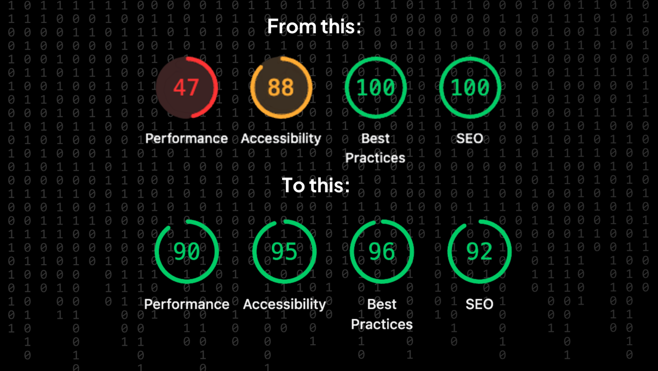
Mobile page load speed improved significantly
On the old website, the most important part of the page often took a long time to appear on mobile. In our tests, that was roughly 11 to 22 seconds depending on the page.
On the refreshed site, that dropped to roughly 1.5 to 3.9 seconds.
So instead of people waiting and wondering if the site is working, the main content shows up quickly and the page feels ready to use.
Desktop became consistently quick to load
We came with proof. We benchmarked the original site before launch, then a day Desktop wasn’t as extreme as mobile, but it still had room to improve.
On the old site, the main content typically appeared in roughly 2.3 to 4.2 seconds.
On the refreshed site, that dropped to around 0.7 to 1.3 seconds.
In other words, desktop users stop seeing loading delays and started getting the content almost straight away.
The site got lighter
The refreshed site also asked browsers to do less work and download less data.
This led to less waiting, especially on slower mobile connections, and less unnecessary “stuff” loading in the background just to view a page.The refreshed site also asked browsers to do less work and download less data.
Hear the results directly from the client:
Thanks so much for your help with our website. It has made a huge difference and it is a pleasure to work with you.
-Claire Fenwick
Why does this matter for your brand?
Performance is not a vanity metric.
It’s how your brand feels online.
A faster site builds trust quicker. It keeps users moving. It reduces drop off. It supports SEO. It makes it easier for people to do the thing you actually want them to do, whether that’s enquiring, booking, calling, or finding key information. Studies show, if a site takes more than 3 seconds to load then 50% of users are likely to abandon it.
There was also an environmental benefit. By cutting this page transfer sizes by over 50%, the site now uses far less data, which helps to reduce its overall carbon footprint. Essentially, less load so less is wasted.
As a B Corp, this kind of outcome matters to us. Building leaner, more efficient websites is a practical way of reducing digital waste and creating a more responsible digital space.
What we can do for you
If you’re planning a refresh, or you suspect your site is being held back by heavy pages, slow mobile load times, or too many moving parts, we can help.
We can benchmark your current site, identify what’s causing the drag, and put together a practical plan to improve speed, stability and page weight without compromising design or content.
If you want us to run the same style of benchmark on your website, drop us a message. We’ll show you what’s possible, with more proof just like this.
You can also take a look through some of our case studies and explore the work we do for our clients.
The takeaways
From a visitor’s point of view, the visual differences between the old and new sites are subtle.
But beneath the surface, the changes are significant.
The site is faster, lighter and far easier to use. Meaning it’s also more responsive, more trustworthy and better represents such a brilliant business.